
Dundee Double Shot Coffee
A refreshed brand that captures the quirky spirit of a neighborhood corner coffee shop.


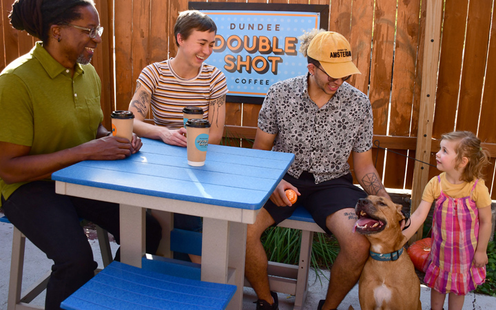


Bringing out the fun and the joy of a small corner coffee shop with ridiculously good coffee.
Challenge
Dundee Double Shot Coffee didn’t have a brand identity that really spoke to them or their customers, and their existing physical space had seen better days. A cohesive new brand was the goal, one that brought out the funny and joyful spirit of the owners and baristas, and to proudly display their commitment to building relationships and community, and of course, making ridiculously good coffee. We also needed to bring the brand to the exterior with a fresh coat (or three) of paint.
Ultimately, the goal was to personify their love of all things coffee and the happy atmosphere they created daily — to encourage even the busiest commuters, to make time for Dundee Double Shot, and bring a smile to their faces the minute they came across it.
Solution
Wheelhouse focused on three main objectives for the rebrand: that it would be energetic, full of character and be playful. We started with creating a bold custom wordmark that had a nod to pop-art and added an exaggerated drop shadow to bring out a feeling of dimension and confidence.
Next came the vibrant and dynamic color palette, which was immediately applied to the building amid the exterior updates. Then the existing electrical signage boxes were fixed so the new outdoor signs could shine brightly and do their job of attracting the attention of all those passing by.
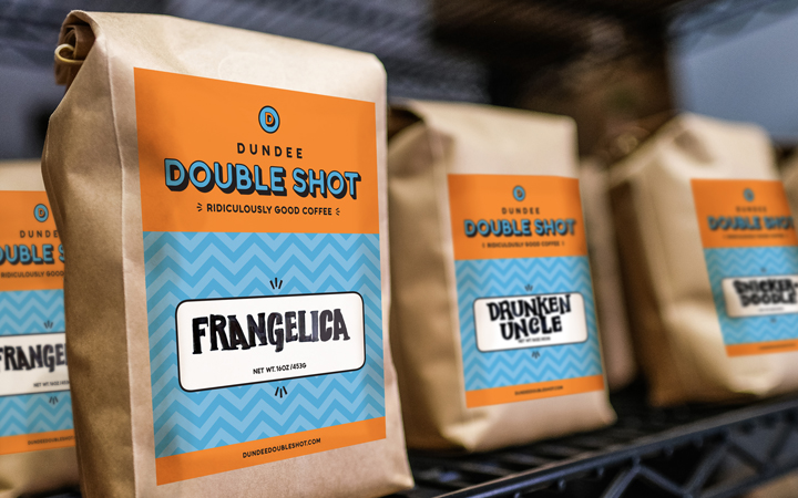
The personality-led brand brought out a sense of humor by combining a conversational and friendly writing style, with casual geometric patterns and playful illustrations. The shop’s new tagline – Ridiculously Good Coffee – perfectly summarized their product and guided the customer to anticipate the level of coffee and care they were about to experience.
Taking every touchpoint as a new opportunity to bring even more joy, we went to work creating so many brand components: an identity system, punch cards, coffee bag labels, postcards, posters, marketing, digital graphics, hats and aprons for the baristas, and exterior signage and wayfinding. Oh, we didn’t forget about the dogs either.
Result
The new brand reflects the fun and friendly place Dundee Double Shot always has been, a place to get ridiculously good coffee, in a quirky area of town, that embraces friends, neighbors, co-workers, and visitors alike. If you’re ever in Omaha, please stop by.
Phase one is complete. Stay tuned for more.
Services
branding, illustration, creative direction, copywriting, logo and identity design, package design, signage, wayfinding, marketing, digital design
Collaborators
Strategy, Creative Direction, Copywriting, Design & Illustration: Cathy Solarana

