
Long View Bits
An identity and website for an IT solutions partner in it for the long haul.


Attentive IT company gets branding that reflects their friendly approach.
Long View Bits is a vision-forward IT company that implements automation and virtualization solutions not only to solve existing issue, but to prevent future problems.
Challenge
Long View Bits had to overcome the perception that it’s a one-man operation handling basic computer problems. Sure, it’s a service that the company provides, but that’s only a fraction of its capabilities. Unfortunately, the company’s branding and design didn’t convey the breadth and depth of its core competencies, which hindered growth.
Aaron Kulbe, founder of Long View Bits, approached Wheelhouse to create a new brand to match the company’s vision and future. The brand needed to demonstrate that the Long View Bits team can handle any network situation and is quite proficient in creating customized technology solutions through automation and virtualization. The company’s approach is based in taking the time to partner with clients, understand their businesses and figure out how technology fits into it. Unfortunately the old brand didn’t convey the breadth and depth of Long View Bits’ competencies. It certainly didn’t help Aaron grow his client base. Aaron approached Wheelhouse for a brand refresh that accurately conveys his company’s expertise and personality, putting them on IT department radars.
Solution
We developed a brand that’s unexpected and a little quirky — just like Long View Bits. At the same time it instills trust and competence.
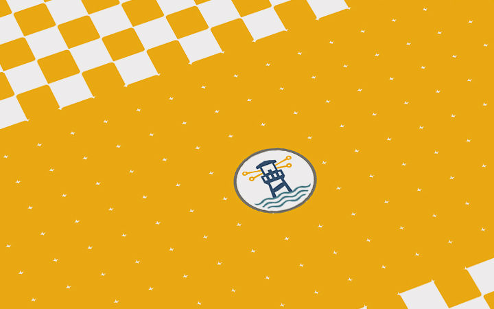
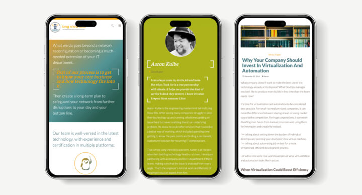
As we got to know Aaron and his team, their superhero nature was revealed. They could come in and save the day for clients who had tried everybody else to no avail. And once clients hired Long View Bits, they kept the partnership going. Aaron’s company could fix that immediate problem and then create a long-term strategy to keep everything running smoothly. With those characteristics in mind, we created an iconic logo using a lighthouse. It symbolized forward movement, helping clients move past frustrating and immobilizing network problems that result in downtime and lost earnings. Finally, we incorporated a contemporary and colorful palette along with some geometric graphics to complete the identity and let their personality truly shine.
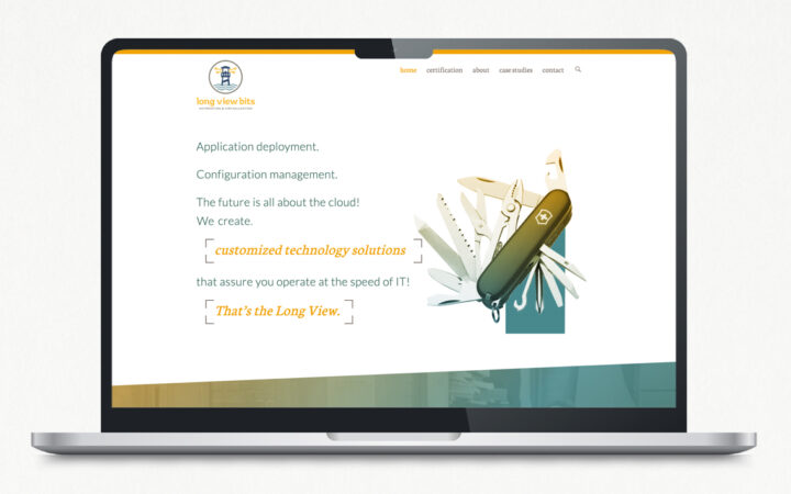
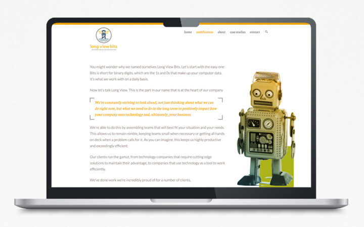
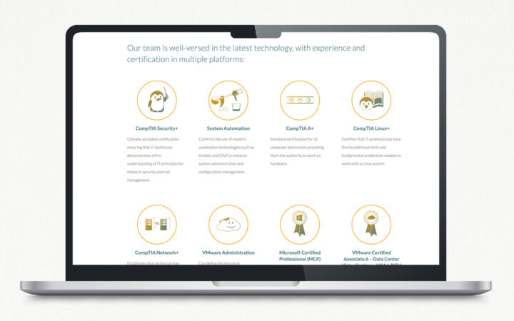
For the website, we captured Long View Bit’s holistic approach to solving and preventing technology problems with unconventional imagery, complex information made accessible and a little movement. It’s as enjoyable to read as it is to look at.
Being the strong, dependable overseer, Long View Bits’ new confident brand delivers a first impression of skill and smarts, that’s approachable. It conveys how the team uses their expertise daily to solve the most complicated challenges. The Long View Bits story was balanced with unexpected imagery for a refreshing look within the industry. When it comes to all of your computer and network problems, this is the company you want on your side.
Services
brand strategy, logo, identity, copywriting, technical writing, web strategy, web design & development
Collaborators
Strategy, Creative Direction & Design: Cathy Solarana
Copywriting: Neveen Hegab
Technical Copywriting: Chris Wolfgang
Web Design & Development: Daniel Svoboda

