
River City Mixed Chorus
Created a brand, website, and communication materials to match the dynamic performances of Nebraska’s first and only LGBTQ+ chorus.


Singers, performers, activists, allies — what can’t River City Mixed Chorus members do?
Challenge
Imagine, you’re the first and only LGBTQ+ chorus, not just in your city, but in the entire state, with everything going for you — a loyal following that fills seats at every performance; more than 130 members dedicated to embracing diversity, identity, community, and, oh yeah, singing their hearts out; and a powerful legacy built on a foundation of belonging that will continue to be there for future generations. Yet your brand is projecting a message of “Meh.”
As its star was rising, River City Mixed Chorus (RCMC) knew it was time to rethink a few of its lackluster brand elements. That’s when the chorus’s marketing team reached out to Wheelhouse Collective. They knew that the strategic minds at Wheelhouse would help them create a new look and feel that’s more in line with their personal flair.
Solution
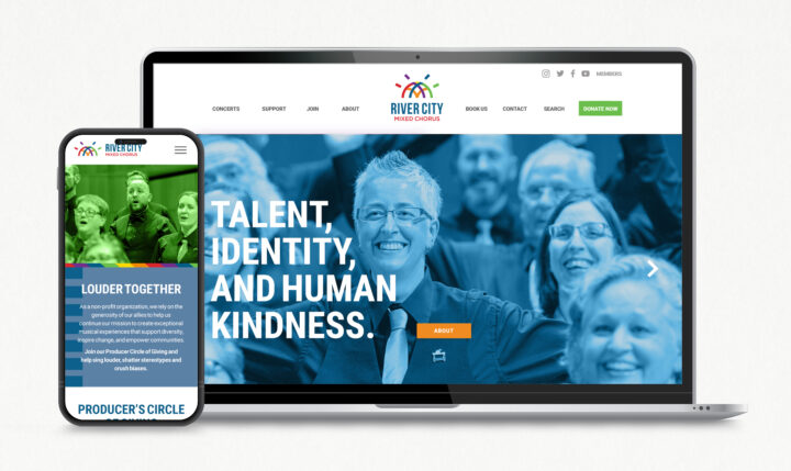
Before opening a new copy doc or firing up InDesign, the Wheelhouse team kicked things off with an in-depth questionnaire and follow-up meeting to get to know the chorus — learn about their values, goals, and collective personality. What we learned helped inform the creation of a refined identity that included an artful logo, color palette, and tagline that captured the heart of the chorus.
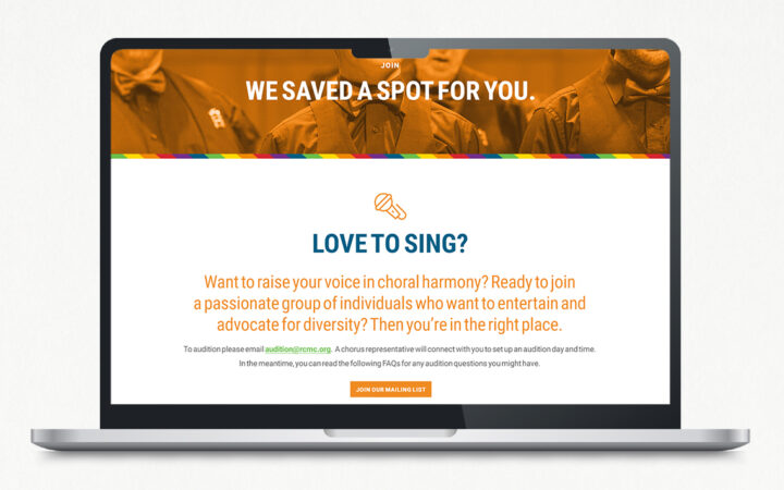
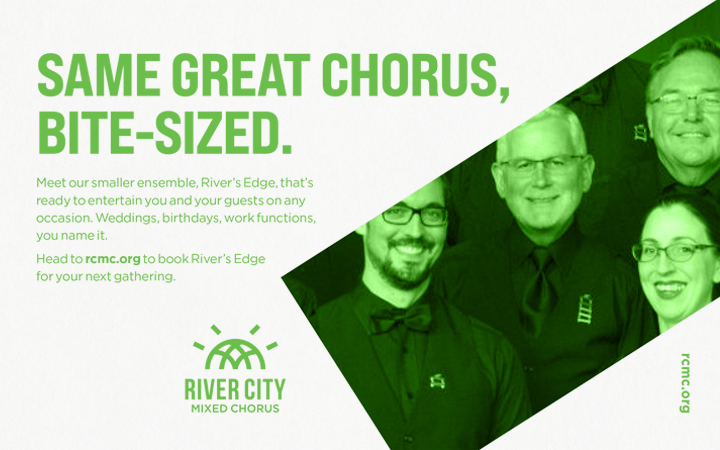
We designed a website that’s full of life and movement, with a reinvented tone that’s welcoming and cheeky. We made it even easier for people to donate, purchase tickets, become members, and book the chorus’s smaller ensemble for private functions. We also crafted a brand guide to help the marketing team uphold its new visual and verbal image throughout its communication materials. Ultimately, we established a brand that accurately reflected the chorus’s progressive thinking, lightness, brightness, vocal stylings, and sparking personality.
Results
When the marketing team unveiled the new brand to the RCMC family, they received an overwhelmingly positive response from their members — all 130+ of them. It was the first time the chorus partnered with a strategy and communications agency in developing a cohesive brand that’s in harmony with the ensemble’s vision and values.
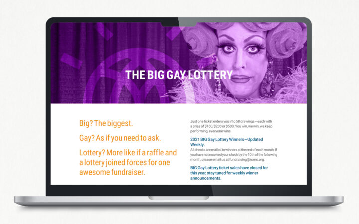
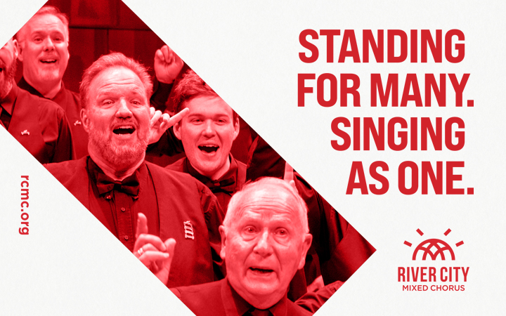
Happy with their Wheelhouse partnership, RCMC tapped the team once more for additional materials, including show posters for their first couple of performances after more than a year of social distancing, executions for their table at Pride, and their concert program, to name just a few.
Services
brand strategy, branding, logo design, identity design, copywriting, art direction, campaign strategy, social media, web design, web development
Collaborators
Strategy, Creative Direction & Design: Cathy Solarana
Strategy & Copywriting: Neveen Hegab
Web Development: Brian Wetjen
Design: Bo Walker

