Letterpress Love
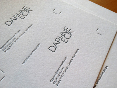
It is moments like these that I love, love, love, being a designer. Part of the branding project that I have been working on for months, business cards for writer and creative strategist, Daphne Eck, is finally being printed and not only printed, but we get to letterpress them.
There is something about the art of letterpress that is beyond special.
I’m not knocking the semi truck-sized, 8-color press, with aqueous capabilities, those have their purpose, but to walk into a room with letterpress machinery from the early 1900’s that probably weigh more then my car, is just so exciting and energizing.
Everything about the process is beautiful, from the thick uncoated paper that is used, to the shapes and forms of the presses, to the well worn metal parts blackened with oil over time, to the simple and methodic sounds that each moving part makes, creates an elaborate symphony the juxtaposes history in a modern moment.

Then there is the actual printing. Time slows. The goal is not to print 1,000 sheets per minute, but more like 1 or 2. The pressman places a single sheet of thick paper on a wooden board, that has quite frankly seen many decades of paper, then manually moves the arm lever and uses his hands to guide the paper on the round drum as it turns and is pressed into the plate to make each impression. Then the printed sheet is placed carefully in a pile to dry. One by one, the blank sheets are printed and transformed into, in this case, one color of Daphne’s 2 color business cards. We still have another color to go.
The rollers are cleaned, tested, cleaned again and then it was time to make the second color from scratch. Mixing color is definitely a rare art form that deserves as much recognition as letterpress does. You just don’t pull the color off the shelf ready to go. It is a combination of using just the right base colors, weighing each one to get the correct mix and then add in years of experience and testing to come up with the correct color. (By the way, Christopher from Porridge Paper, did it in one try). Then taking the newly created color—it was pms 622 for Daphne, and go back and repeat the printing process all over again.

The overall success of the final printed piece, no matter how many colors are used or how simple or complicated the design is, is dependent on the meticulous detailed nature of the pressman and their process.

Not every project should be letterpressed. It’s an unhurried, hand-crafted method that’s appropriate for representing a brand that embodies similar characteristics. Each card is printed one-at-a-time, just like the attention each of her clients receives. Solutions are customized to meet each person’s individual needs.

All these details come together, turning the experience of receiving her card into a memorable moment that leaves a lasting impression.
I love letterpress. Who’s next?


0 Comments